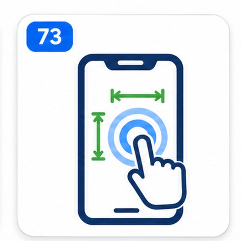
Understand why the clickable area matters more than the icon
A touch target responds when someone activates a control with a finger, stylus, mouse, or other pointer. It need not match the visible icon. A small cart symbol may sit inside a large button, while a decorative outline may not enlarge a tiny link.
This matters to people with tremors or limited dexterity and to anyone using a phone while moving. The aim is to avoid accidental activation of neighboring controls.
Compare the WCAG 2.2 minimum with the enhanced target size
Two WCAG success criteria discuss pointer target dimensions. They serve different conformance levels and should not be treated as interchangeable.
The WCAG measurements are in CSS pixels, not physical screen pixels. A high-density phone can display several hardware pixels for one CSS pixel. Browser zoom does not make an undersized CSS target meet the criterion merely because it appears larger on the screen.
Measure the actual interactive boundary
Review the element that receives the pointer action: usually a button, link, form control, or custom interactive widget. CSS padding on that element can enlarge its active area without enlarging the icon. Margins can separate targets, but margins alone do not expand what the user can tap.
Inspect computed dimensions and the box model in browser developer tools. Transforms, clipping, and overlapping controls can reduce the usable area. A nominal 24-pixel box is not automatically sufficient if another control obscures it.
For unusual shapes, an axis-aligned 24-by-24 CSS pixel square must fit inside the target to satisfy the size test. A 24-pixel-diameter circular target may instead require a spacing assessment.
Apply the spacing exception accurately
WCAG 2.2 AA does not demand that every small target be enlarged. An undersized target can meet the spacing exception if a hypothetical circle 24 CSS pixels in diameter, centered on its bounding box, does not intersect another target or the corresponding circle for another undersized target.
Imagine two 20 × 20 pixel square buttons in a row, separated by a 4-pixel gap. Their centers are 24 pixels apart, so the imaginary 24-pixel circles touch without overlapping. That arrangement can satisfy the spacing test, assuming there are no interfering targets elsewhere. Two 20-pixel buttons placed directly against each other would not satisfy it.
Four pixels of margin is not a universal fix. The necessary clearance depends on the arrangement and sizes of neighboring targets. Larger active areas are often easier to maintain.
Know the other permitted exceptions
A checker may highlight controls that are smaller than the numeric threshold but still require manual interpretation. WCAG 2.2 SC 2.5.8 includes these additional exceptions:
- Equivalent: A separate control on the same page offers the same function and meets the criterion.
- Inline: A target appears within a sentence or its size is constrained by the line height of surrounding non-target text.
- User agent control: The browser determines the control’s size and the author has not modified that size.
- Essential: A particular presentation is essential to the conveyed information or is legally required.
Exceptions do not automatically apply to compact navigation or toolbar icons. Document which exception genuinely applies before resolving a warning.
Follow a practical target-size review
- Choose the real page state. Review the page after it has loaded, including the mobile menu, any open dialogs, and relevant expanded controls.
- Identify pointer targets. Look for navigation links, icon buttons, checkboxes, close controls, pagination, and custom widgets.
- Inspect reported sizes. Compare the actual active boundaries with the 24 × 24 CSS pixel minimum; do not measure artwork alone.
- Examine nearby targets. For undersized controls, check the precise spacing exception rather than assuming all small targets fail.
- Evaluate legitimate exceptions. Inline text links and unmodified native browser controls may need different treatment.
- Retest interaction. Confirm the intended action still works and that nearby controls, focus appearance, and layout are not damaged.
A source-markup-only check cannot establish actual target geometry, which depends on CSS, viewport, fonts, and component state.
Make icon-only buttons easier to tap with CSS
The cleanest fix often changes the button’s interactive box while keeping the artwork compact. The following example creates a 44-by-44 CSS pixel minimum box around an icon. It exceeds the WCAG AA size threshold and aims for the enhanced size recommendation.
<button type="button" class="tap-control" aria-label="Open search">
  <svg aria-hidden="true" viewBox="0 0 24 24">
    <circle cx="10.5" cy="10.5" r="6.5" fill="none" stroke="currentColor" stroke-width="2"/>
    <path d="M15.5 15.5L21 21" fill="none" stroke="currentColor" stroke-width="2"/>
  </svg>
</button>
.tap-control {
  display: inline-flex;
  align-items: center;
  justify-content: center;
  min-inline-size: 44px;
  min-block-size: 44px;
  padding: 10px;
  box-sizing: border-box;
}
.tap-control svg {
  inline-size: 20px;
  block-size: 20px;
}
This example is not tested against your theme. Preserve visible keyboard focus, a meaningful accessible name, and working behavior.
Check crowded navigation, pagination, and form controls
Mobile headers often place search, account, cart, and menu buttons in a tight row. Inspect the clickable element for each icon, not its SVG file. When space is limited, consider fewer visible actions, a secondary menu, or a layout with enough room for the controls to remain independent.
Pagination digits can be tiny clickable areas despite generous visual gaps. Apply padding to each interactive anchor or button. For checkboxes and radio buttons, ensure the visible area matches a usable input or associated label.
Target size works alongside other accessibility checks. Use the Form Label Checker for control names, the Link Text Checker for understandable links, and the Color Contrast Checker when action boundaries or focus states are hard to perceive.
Review mobile breakpoints and WordPress components
A target that works on desktop may shrink at mobile breakpoints. Test different viewport widths, enlarged text, and plugin-generated controls such as chat launchers or close buttons.
In WordPress, inspect theme navigation, reusable blocks, ecommerce plugins, cookie notices, and widgets. Fix the component at its source instead of changing all site links with a broad CSS selector.
For custom components using ARIA states or roles, check their semantics with the ARIA Attribute Checker. Proper target sizing does not replace an accessible name, correct expanded state, or keyboard operability.
Understand what an automated checker cannot decide
Geometry alone cannot establish WCAG conformance. Menus reveal new controls, overlays can obstruct them, and scripts can change hit areas. Automated tools may not access cross-origin frames or authenticated content.
Manually test pointer activation, keyboard access, and visible focus. Record the viewport and component state. A clean report is not accessibility certification or a search-ranking guarantee.
Frequently asked questions about touch target sizing
Is 24 × 24 CSS pixels enough for WCAG 2.2 AA?
It meets the numeric size threshold for SC 2.5.8 when the effective target contains the required square and its clickable area is not improperly obscured. Smaller targets can sometimes conform through the spacing or other specified exceptions. Larger targets are often more comfortable in real use.
Do all mobile buttons need to be 44 × 44 pixels?
No. The 44 × 44 requirement is a Level AAA threshold under SC 2.5.5. Level AA SC 2.5.8 uses 24 × 24 CSS pixels, with exceptions. Larger sizes remain a useful design goal.
Does adding margin increase the touch target?
No. Margin generally adds space outside an element’s clickable box. It can sometimes help meet the spacing exception, but padding applied to the interactive element is a more direct way to enlarge the area users can activate.
Are links inside article paragraphs exempt from target-size rules?
Links within running text may qualify for the inline exception. A standalone row of navigation links is not automatically exempt.