How to Check WordPress Color Contrast for Accessibility
How Do You Check Color Contrast on a WordPress Website?
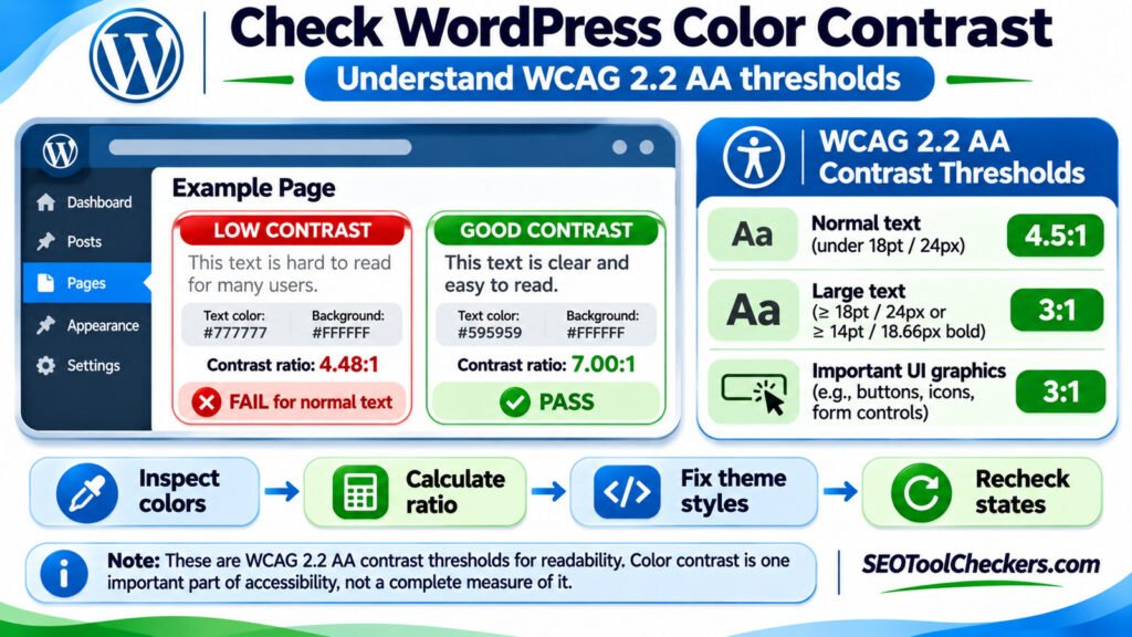
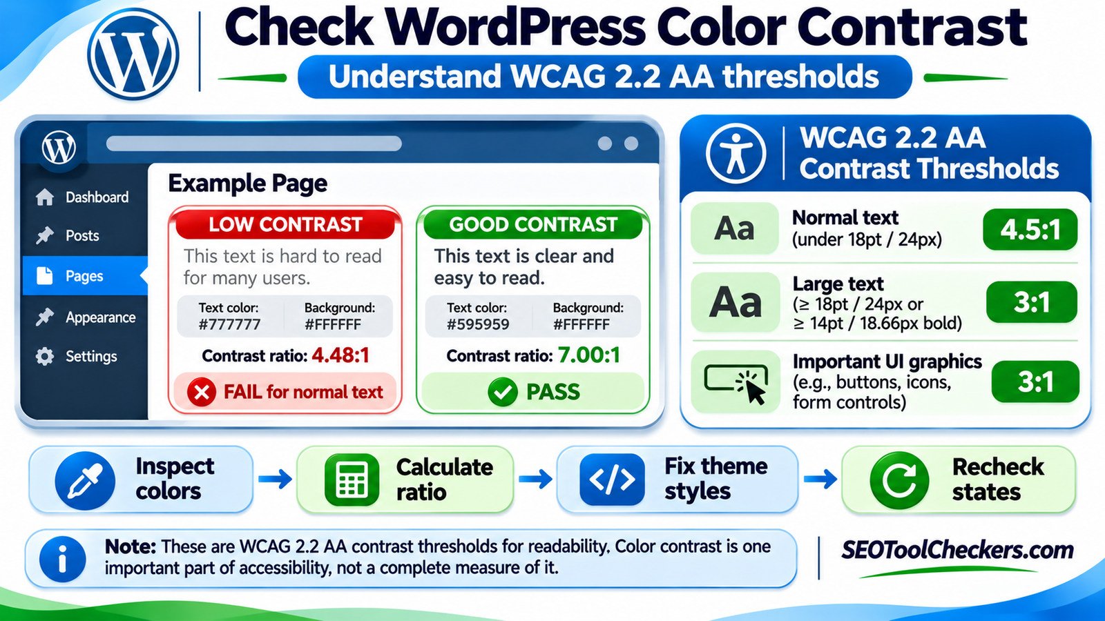
To check WordPress color contrast for accessibility, compare each text or essential interface color with the background behind it, then evaluate the result against the applicable WCAG contrast threshold. Under WCAG 2.2 Level AA, ordinary text generally needs at least 4.5:1, large text needs 3:1, and meaningful non-text interface cues generally need 3:1. Check the actual published page—not just your theme palette—and retest buttons, links, forms, hover states, and mobile layouts after making changes.
Start With the Right WCAG Contrast Threshold
Color contrast is a measurement of the difference in relative luminance between two colors. The larger the ratio, the greater the difference between the lighter and darker colors. WCAG ratios run from 1:1, where the colors have identical luminance, to 21:1, the maximum for black and white.
The distinction between text and non-text interface cues is important. A button label is text and usually follows the text threshold. An icon that is the only visible indicator of an action, or a necessary field border, may fall under the non-text threshold. Applying 3:1 to every button label would miss failures.
| Element | WCAG 2.2 criterion | Level AA minimum |
|---|---|---|
| Body copy, ordinary links, labels, small button text and placeholders | 1.4.3 Contrast (Minimum) | 4.5:1 |
| Large text: at least 18pt regular or 14pt bold | 1.4.3 Contrast (Minimum) | 3:1 |
| Visual information necessary to identify a control or its state | 1.4.11 Non-text Contrast | 3:1 against adjacent colors |
| Essential parts of meaningful graphics | 1.4.11 Non-text Contrast | 3:1 where the distinction matters |
| Ordinary text at Level AAA | 1.4.6 Contrast (Enhanced) | 7:1 |
| Large text at Level AAA | 1.4.6 Contrast (Enhanced) | 4.5:1 |
In typical CSS sizing, 18pt equals 24 CSS pixels, while 14pt is about 18.7 CSS pixels. Weight matters: a 20px heading is not automatically “large text” unless it also meets the bold-size criterion. Font appearance and browser rendering can still affect readability even when the mathematical ratio passes.
Which contrast exceptions actually apply?
WCAG 1.4.3 excludes genuinely incidental text, purely decorative text, text in inactive controls, and lettering within logotypes. These are narrow exceptions, not a reason to use faint text throughout a design. For example, a disabled button’s label may be exempt from the minimum text threshold, but a placeholder in an active form field is not simply “decorative” because it looks pale.
For criterion 1.4.11, inactive controls and visual aspects provided by the browser without author modification are treated differently. Not every button needs a contrasting outline if the button’s text or another visual cue already makes it identifiable. Evaluate what users genuinely need to perceive rather than treating every border as a universal 3:1 requirement.
A Real Contrast Example: One Shade of Gray Makes the Difference
Consider a WordPress paragraph displayed on a white background. A designer may choose medium gray because it looks softer than black. Yet two nearly identical shades can fall on opposite sides of the WCAG AA boundary.
| Foreground | Background | Calculated ratio | Normal text (AA) |
|---|---|---|---|
#777777 |
#FFFFFF |
4.48:1 | Fail |
#767676 |
#FFFFFF |
4.54:1 | Pass |
#595959 |
#FFFFFF |
7.00:1 | Pass; also meets AAA for ordinary text |
#9CA3AF |
#FFFFFF |
2.54:1 | Fail |
These ratios use the standard relative-luminance calculation for opaque sRGB colors and are rounded here for readability. Do not round a failing measurement upward: a true ratio of 4.499:1 is below 4.5:1, even if a display rounds it to 4.50.
A practical design choice is to aim comfortably beyond the minimum. The difference between 4.48:1 and 4.54:1 is small, and faint or thin fonts can remain difficult to read in real use. Higher-contrast text offers more margin for viewing conditions and future design changes.
How to Test Colors on a Live WordPress Page
Start with one representative page rather than checking random hex codes from a style guide. Your WordPress theme may combine global colors with individual block colors, plugins, opacity settings, and overlays. The actual colors reaching the visitor can differ from the palette configured in the dashboard.
- Choose a representative page: include headings, body paragraphs, text links, call-to-action buttons, a form, and at least one card or colored banner.
- Inspect the element: right-click text in your browser, choose Inspect, and examine the computed
colorand the background or underlying layer. - Record the effective pair: capture the actual foreground and background values. With transparency or overlays, work out the final visible color rather than assuming the CSS foreground is fully opaque.
- Check the ratio: enter the pair into the SEOToolCheckers Color Contrast Checker and compare the result against the appropriate text or non-text criterion. The tool URL is from the supplied tool inventory; check its interface and live availability before relying on it operationally.
- Check interactive states: examine hover, focus, pressed, selected, error, and disabled appearances where relevant. A legible normal button can become difficult to read when hovered.
- Fix and retest: update the responsible WordPress style, clear any relevant page cache, reload the published URL, and measure again.
Test at both mobile and desktop widths. Responsive layouts may reposition text over different parts of an image or use alternative navigation colors. A contrast ratio that passes on one screen does not guarantee the same outcome in every layout.
What if the background is a gradient or photograph?
A single solid-color calculation cannot describe text over a changing photograph or gradient. Check the portions behind each line of text, especially the area with the lowest contrast. A semi-transparent dark overlay or solid text container can make contrast more consistent. If the page includes a hero heading over a photograph, test the real composition at relevant viewport sizes, not just a handpicked attractive crop.
Image-editing eyedroppers can be useful for spotting problem areas, but an individual screenshot pixel may include anti-aliasing or compression artifacts. For ordinary text rendered by the browser, inspect the underlying CSS colors when possible. For layered backgrounds, calculate or measure the effective composite color and review the visual result as well.
Fixing Low-Contrast Colors in the WordPress Editor
Choose the smallest change that addresses the actual source of the failing color. If a shared theme color is wrong, correcting it globally is usually more maintainable than editing hundreds of posts. If only one promotional block uses faint text, make a local change instead.
For block themes: use the Site Editor
In a block theme that supports Site Editing, open Appearance > Editor > Styles > Colors. Review text, background, link, and element colors. Check the global palette, then look at individual blocks where editors may have applied custom colors. WordPress can show contrast warnings for certain editor color combinations, but those warnings do not replace testing the published site, dynamic states, and custom code.
For classic themes: inspect theme settings and added CSS
On a classic theme, colors may live under Appearance > Customize, a theme-specific options panel, or Additional CSS. Menus vary by theme and WordPress version. A page-builder plugin or custom block can also override global text colors. Use the browser’s computed styles to identify the exact rule before changing it.
For example, the following is an illustrative CSS pattern, not a universal fix or a verified selector for your site:
/* Example only: adapt selectors to your theme. */
.example-content {
  color: #595959;
  background-color: #ffffff;
}

.example-button {
  color: #ffffff;
  background-color: #1d4ed8;
}

.example-button:hover,
.example-button:focus-visible {
  color: #ffffff;
  background-color: #1e40af;
}
These colors are chosen to show clear text contrast, but real controls still need checks for the background around the control, focus visibility, disabled behavior, and the full mobile interface. Avoid indiscriminate use of !important, which can mask the underlying theme or plugin rule and make future changes harder.
Common WordPress Contrast Failures That Get Missed
| Where the issue appears | Why it happens | What to check first |
|---|---|---|
| Gray placeholder text in forms | A theme reduces opacity or uses a very light gray | Placeholder color and its actual field background |
| Text on gradient buttons | One end of the gradient is much lighter | Text contrast at the least contrasting portion |
| Navigation and footer links | Dark-mode backgrounds use muted link colors | Normal, hover, focus and visited states |
| Text over featured images | The background changes with each image or screen size | Worst-case image area and overlay opacity |
| Form borders and selected states | Important cues disappear into nearby colors | Required visual boundary or state indicator against adjacent colors |
| Error and success messages | Only red or green communicates status | Text contrast, icons, and wording that conveys meaning without color alone |
Some issues are adjacent to contrast rather than contrast failures themselves. For example, a text link that is distinguished only by color may raise a separate Use of Color concern even if it meets 4.5:1 against the page background. When reviewing navigation and inline links, a Link Text Checker can help you consider whether link wording is meaningful; underline and non-color cues still require a visual review.
Contrast Is Only One Part of WordPress Accessibility
A contrast test cannot tell you whether form inputs have programmatically associated labels, whether a page’s headings follow a meaningful structure, or whether an image is understandable without seeing it. Treat contrast as one item in a broader accessibility review, not as proof of WCAG conformance or a guarantee of better search rankings.
After addressing colors, use a Form Label Checker to review form-label associations and an ARIA Attribute Checker to look for attribute problems in interactive components. These checks complement contrast evaluation; they do not replace keyboard and screen-reader testing.
For content organization, review landmarks with the HTML Landmark Checker and heading patterns with the Heading Structure Checker. For visual media, the Image Alt Text Checker addresses another important accessibility requirement that a color measurement cannot detect.
Mobile layouts deserve a separate interaction check. The Touch Target Size Checker belongs in that workflow because a perfectly legible link may still be frustrating to activate when tightly packed against neighboring controls.
A Repeatable Color Contrast Audit for WordPress
A complete review should sample every important template and component type: homepage, article, category archive, search page, contact form, product page if applicable, navigation, footer, and modal or dropdown content. You do not need to begin by auditing every URL manually if many pages share the same template.
- List your site’s main page templates and reusable blocks.
- Capture text and essential interface color pairs for each component.
- Apply 4.5:1, 3:1, or another relevant standard based on the element and font size.
- Prioritize global color tokens that affect many pages, followed by individual exceptions.
- Test hover, focus, disabled, error, selected and mobile variants where applicable.
- Document the color before and after the change, the measured ratio, and the page or component that was rechecked.
Retest after theme updates, page-builder updates, new promotional banners, or a brand color refresh. A passing audit documents specific tested conditions; it is not a permanent statement that every combination of content, device, and future theme setting is accessible.
Frequently Asked Questions
What is a good color contrast ratio for WordPress body text?
At least 4.5:1 meets the WCAG 2.2 Level AA minimum for normal text in most cases. A higher ratio often gives a more comfortable margin, especially with smaller fonts or low-weight typefaces.
Is 3:1 enough for a WordPress button?
It depends on what you are evaluating. The ordinary text label on the button generally needs at least 4.5:1 against its background. Important non-text visual information used to identify the control or its state generally needs 3:1 against adjacent colors, subject to the criterion’s exceptions.
Do WordPress themes automatically meet WCAG color contrast standards?
Not necessarily. A theme may ship with accessible default colors, but custom palettes, block overrides, images, plugins, and later edits can introduce failures. Test the actual page and the states users encounter.
Does a 4.5:1 ratio guarantee that a page is accessible?
No. Contrast is one criterion. Accessibility also includes keyboard access, readable structure, usable forms, meaningful text alternatives, focus visibility, reflow, and more. A numerical pass is useful evidence for one color pair, not a full-site certification.
Should I check contrast in dark mode too?
Yes. If your theme or plugin provides dark mode, test its foreground/background pairs and interactive states separately. A color combination that passes on a white background may fail in a dark appearance or over an image.
What to Do First
Open a typical WordPress post, inspect its body text color against the real background, and measure the pair. Then check links, buttons, forms, navigation, and focus states before adjusting the theme or block colors. Use the correct WCAG threshold for each element, fix shared styles at their source, and verify the result on the live page. Start with the color pairs readers encounter most often, then broaden the review to templates and interactive components.